
In Response
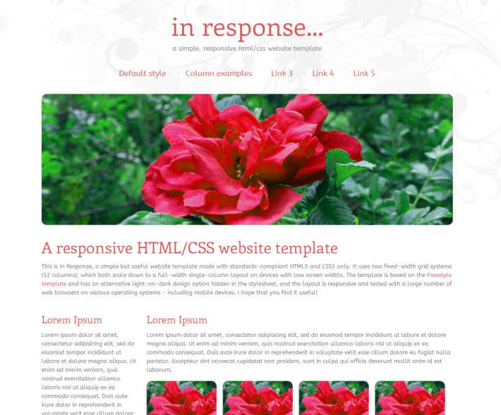
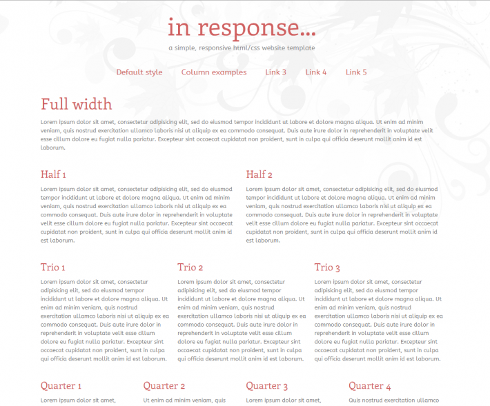
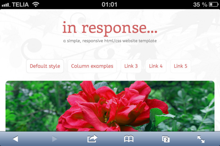
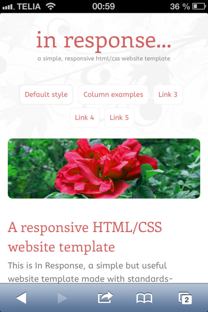
A simple and optimized HTML5/CSS3 website template with a responsive layout. It is based on the dual-grid system from the Freestyle template but with several useful additions. In Response offers fixed-width 12-column grids, which both scale down to a full-width single column layout on mobile devices. Multi-column layout samples are included, as well as a simple thumbnail class that can be used for photo galleries. Also included, although not shown in the template, is a light-on-dark design option that can be applied by removing the “light” body class.
Grid, Multiple layouts


