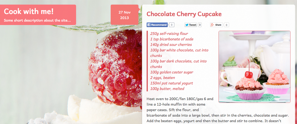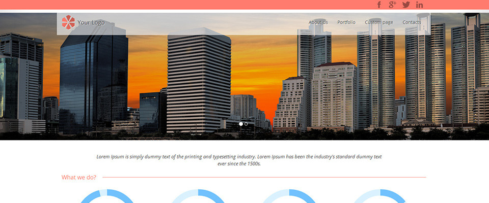

Mobile layout of the “In Response” template updated
The new In Response CSS template features a simple media query that makes the layout responsive, scaling the fixed-width and multi-column grid layout down to a full-width and single-column layout on mobile devices. I mentioned this in the template release description, but I didn’t upload any screenshot of the mobile layout at the time of…
New free website template: In Response
In Response is a simple, optimized and free HTML5/CSS3 website template with a responsive layout. It is based on the dual-grid system from the Freestyle template but with several useful additions. In Response offers fixed-width 12-column grids, which both scale down to a full-width single column layout on mobile devices. Multi-column layout samples are included,…
New premium template: Expressions
A new premium HTML/CSS template has been published, called “Expressions”. It is a somewhat different kind of design compared to the previous templates, since it puts a lot of focus on a large image slideshow and a matching thumbnail gallery with lightbox popups. Expressions is built with standards-compliant HTML5 and CSS3, it is responsive and…
Introducing: Luft – A premium HTML/CSS template
Today it is time to announce template #100 on andreasviklund.com, and it will be a somewhat different kind of release since it is the first commercial, premium website template on andreasviklund.com. The new template is called “Luft” (the Swedish word for “air”), and it is based on the Freestyle CSS grid – with a well…
Mobile website templates gallery added
Some of the HTML/CSS templates on this site include custom styles that makes it possible to build easy-to-read layouts for small-screen mobile devices such as the iPhone and Android mobile phones. Today, a new page has been added where these custom mobile template designs are highlighted: The mobile website templates page. It shows the mobile…

