

New free website template: In Response
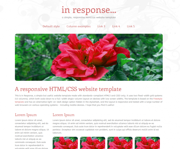
In Response is a simple, optimized and free HTML5/CSS3 website template with a responsive layout. It is based on the dual-grid system from the Freestyle template but with several useful additions. In Response offers fixed-width 12-column grids, which both scale down to a full-width single column layout on mobile devices.
Multi-column layout samples are included, as well as a simple thumbnail class that can be used for photo galleries. Also included, although not shown in the template, is a light-on-dark design option that can be applied by removing the “light” body class.
Check it out, and post any feedback you may have in the comments. A follow-up post on customization of the template will follow during the weekend.
This article was written by Andreas Viklund
Web designer, writer and the creative engine behind this website. Author of most of the free website templates, along with some of the WordPress themes.