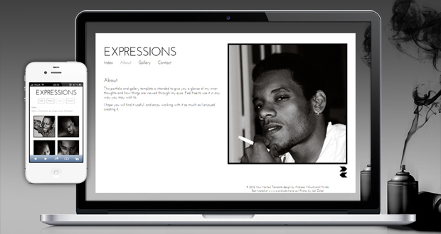
A new premium HTML/CSS template has been published, called “Expressions”. It is a somewhat different kind of design compared to the previous templates, since it puts a lot of focus on a large image slideshow and a matching thumbnail gallery with lightbox popups. Expressions is built with standards-compliant HTML5 and CSS3, it is responsive and scales down to a custom layout on small-screen devices and it still offers the flexibility of a 12-column grid system which allows you to create any kind of layout you may want to. Basic form styles are included as well.
Expressions costs $4, and you can order it directly through the Expressions template page. Check out the screenshots and the live demo for more details:
This article was written by Andreas Viklund
Web designer, writer and the creative engine behind this website. Author of most of the free website templates, along with some of the WordPress themes.
10 comments:
Very nice, I like your style of clean and simple. Your templates are getting better and better. Bargain at $4
Great theme,. I’m an architect and looking for a theme where I can post my portfolios and pics..as I’m not from IT..I was looking for themes…
Simple and elegant, good job Andreas!
Very Great theme, i know your website since Andreas02 and i never forget your url.
Thanks for your style.
Stef
Will you have the template for wordpress?
Fabulous looking theme for a very nice price! Very simple yet elegant!
Hi Andreas,
I just bought a copy of your “expressions” template and have a question. I added more pictures to the Gallery page and it seems that when cycling forwards and backwards though the pictures, the location of the 4 pictures adjusts slightly upwards or downwards, depending on whether you cycle backwards or forwards. With the 4 pictures, this does not seem to matter, although it is visible in the template as well. With more pictures, the next set of 4 pictures creeps prematurely into the frame when cycling back and forth. It seems to do this in IE and FireFox. Is there a quick way to resolve this? Ideally, the 4 frames should stay in the same place, no matter how many pictures are in the gallery I presume? Thanks, Kevin
I had the code fixed by a 3rd party. The website is now live if anyone wants to take a look: http://www.berettaphoto.com
Kevin
I love this theme and use it on, not one, but 3 of my own sites! Thanks a bunch! Cheers
One thing though, I would love to see some more features when it comes to sharing buttons and such:
http://andreasviklund.com/share/sharing-buttons-and-commenting-using-your-facebook-twitter-or-google-account/
Cheers