New template: Basic Noise

Post 136 of 262

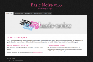
Following the release of Basic Contact yesterday, here is a new basic template design: Basic Noise. It features a tab menu, a feature area (which doubles as a header image area), one or two content columns and a footer. And some hidden options to go with that, for those who dive deeper into the stylesheet. Check it out by clicking the screenshot, or by downloading Basic Noise here.

,

This article was written by Andreas Viklund

Web designer, writer and the creative engine behind this website. Author of most of the free website templates, along with some of the WordPress themes.
6 comments:

Carlos IbanezMay 4, 2011 at 12:00Reply

Hej!
Vill bara tacka för en kanon sida med massa ideer och hjälpmedel som hjälpt mig när jag byggde min enkla sida och hade lite idétorka.
Keep up the good work!
God Bless!
/ Mvh

Carlos I.

AgilitoJuly 19, 2011 at 22:18Reply

Simple is the best.
This dark 2 column template with footer i like the most.
Thx for you hard work.

PozycjonerJuly 22, 2012 at 22:45Reply

I agree with you. We are competitors but I agree at this point. Can be used in many projects.

PozycjonowanieJuly 15, 2012 at 18:33Reply

Nice template, nice coding. If you care about your SEO, taking this is a good idea!

StoffeJuly 28, 2012 at 19:38Reply

Riktigt snyggt, jag lånar Inland temat det var klockrent!
Hög nivå på de nya mallarna, underbart du håller det helt fritt. Respekt

Lavinia PanaitJuly 31, 2012 at 13:01Reply

Very nice, clear and not tired to the eyes. Greetings from Romania

Menu