Two new templates: Variant Rounded and Variant Portal

Post 255 of 262

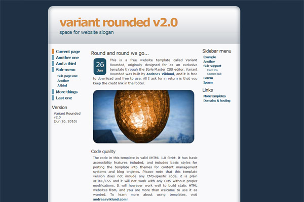
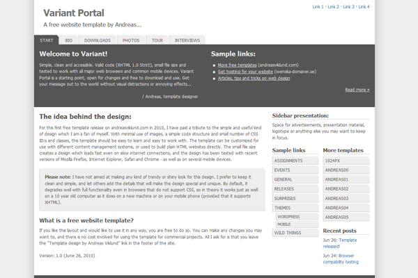
Saturday passed and it is now two hours into Sunday, so this post is a bit late. But the news will hopefully be interesting to you anyway! I have uploaded two new free website templates, called [Variant Rounded->https://andreasviklund.com/templates/variant-rounded/] and [Variant Portal->https://andreasviklund.com/templates/variant-portal/]. As I have in the past, I try to keep the designs simple and useful. Variant Rounded is an 800px-friendly template with more design than content in its basic 3-column layout. Variant Portal is lighter, less colorful, 1024px-friendly and made for sites with more text content that needs to be in focus. Both templates have been tested in multiple web browsers and on mobile devices, and I have not found any problems. The code is valid XHTML 1.0 Strict and CSS2. Basic accessibility features are included, such as skip links and full functionality with screen readers. Like most of my previous designs, these two new templates should be perfectly functional even in browsers that do not support CSS, thanks to the simple code structure.

Screenshots are below, click the images to download each template:

, ,

This article was written by Andreas Viklund

Web designer, writer and the creative engine behind this website. Author of most of the free website templates, along with some of the WordPress themes.
53 comments:

LeandroJune 27, 2010 at 02:25Reply

Hello Andreas!
Great news to have your themes back! Really liked the Variant Portal – straight to the point.
If it’s not much to ask, would you share with us if you have plans to release new themes and what/when should we expect anything?
Cheers!

Natalya PJune 27, 2010 at 07:21Reply

Variant Portal looks really promising. If I had one wish granted, I’d love to see alternate colour schemes, to add a little warmth for instance. Would you consider this as an idea for a future release?

Hans Verkerk de JongJune 27, 2010 at 09:31Reply

The Variant Portal looks great to me and I agree with Leandro that it’s great news to see you back, alive and kickin’;-) I also agree with Natalya that a colorscheme would be great. Would it also be possible to have the Variant Portal available with only one navigation at the right side? Two of them looks a bit overdone, although once again, with all the work you have done, you’re a credit to website developpers!

Andreas ViklundJune 27, 2010 at 10:35Reply

Leandro: During the last couple of weeks, I have worked with finishing several template design ideas from my “unfinished” and “unreleased” folders, as well as creating some new ones. There will be more releases for sure, atleast one new template every week during the summer. Refreshing (or rather rebuilding) the WordPress themes is also a priority, as well as working on a new and improved andreasviklund.com with more related material.

Natalya: That is a good idea. The plain style is intentional, but it would be useful to have options for simple customization added to the template. It would be easy to add, I’ll consider it for the next version!

Hans: When I made Variant Portal, I also made an alternative version with a single sidebar and a smaller feature area. More of a classic blog layout, probably. I considered including it as an alternative stylesheet, but decided against it to keep the template as simple as possible. I will probably release the alternative version separately soon. Including the possibility of easily removing one of the sidebars while keeping the button styles may possibly be added in the next version.

Nurul AzisJune 27, 2010 at 11:52Reply

Variant portal reminds me to Carrington but this one is much more better. Simple and Elegant. I like it. Thanks Andreas for providing both for free. That’s very kind of you.

AdekJune 27, 2010 at 13:31Reply

I’m planning to make a mini site, It seems that Variant Rounded v2.0 looks suitable for my project. Both website themes looks great. I’ll try on my localhost first. Thank you Andreas.

STJune 27, 2010 at 13:42Reply

Very good! I want the second theme: Variant Portal :-) But I wanna change some colors there. Nice work!

WikipetterJune 27, 2010 at 18:27Reply

Another wish for the wish list is a template that looks like BentoBox, but that is free. (I think we are getting spoiled here ;)

DavidJune 27, 2010 at 18:35Reply

Anyone given it a serious try to create Joomla 1.6 templates yet? (it’s in beta 3 now) Making some templates available for Joomla 1.6 would be a great way to make this site even more popular I think.

DanJune 27, 2010 at 23:40Reply

These two are amazing. I’ll download them. So, you’ll produce some more website templates this summer ya Andreas. Good luck! and Thanks!

Translate MaxJune 27, 2010 at 23:57Reply

Hello Andreas! I like the rounded corner and navigation style on Variant Rounded V2.0. You rock!

ChrisJune 28, 2010 at 00:09Reply

Andreas, another excellent effort. Your themes continue to impress me with their clean, intuitive interfaces. Did you do any work in the web usability sphere?
Also, hope you are feeling better.

FacundoJune 28, 2010 at 01:44Reply

Very good, congratulations! I’ll take “Variant Portal”

FrankJune 28, 2010 at 08:08Reply

Great work, i like the Variant Portal but will it maybe use with pastell colors.

HermannJune 28, 2010 at 09:29Reply

The both are clean and beautiful themes.
Is “Variant” the name of your new theme serie, like the previous ones “Andreas” and “Daleri”?

CJJune 28, 2010 at 10:10Reply

Variant Portal and Variant rounded are two good reasons for having you back :)

At 21kb I thought that Rounded was pretty cool. And then you blew me away with 4kb for Portal!

MarcusJune 28, 2010 at 15:19Reply

Hi Andreas,

Great to see you back in action.

I look forward to the release of your WP themes.

Regards
Marcus

KamranJune 28, 2010 at 19:11Reply

Hey Andreas, Thank you for making these 2 beautiful templates.
Totally love them. Looking forward to seeing more.

AnalysmannenJune 29, 2010 at 00:32Reply

Good job! Great to see you back in business. Hoping to see some new WordPress templates soon, hopefully some that are “premium” looking but no extra functionality required, just awesome looks.

MotivadoJune 29, 2010 at 12:01Reply

I agree with all positive comments: good job!! :)

Roliga presenterJune 29, 2010 at 16:23Reply

Great work! The second one looks really clean and simple.

There is actually one thing i would like to see from you. A wordpress theme based on CSS. Only CSS and nothing else. That would be very interesting.

Keep up the good work budd!

Dave BJune 30, 2010 at 03:02Reply

The ability to change the main colour on variant Portal would be a nice feature. I like to use blue like you have up in your header section.

Amenajari InterioareJune 30, 2010 at 04:58Reply

Great work! Waiting for more of course :)
Some premium-looking maybe?
Thank you!

ChrisJune 30, 2010 at 18:48Reply

The templates look nice. however I think that you should not make templates without a single front image in them (Variant Portal). The first one (Variant Rounded) looks very nice to say the least!

JurandirJuly 1, 2010 at 03:21Reply

Keep up the good work and thanks a lot.
What else should I say?, Yeah, the themes are just great :-)
South America – Brasil

BHJuly 1, 2010 at 07:31Reply

That’s great to see you are back with two new themes. I really like the variant portal. Keep up the good work as it certainly is appreciated!

Jim WestergrenJuly 1, 2010 at 14:31Reply

Hi Andreas,
Nice to see that you are back in business and hope you are doing well. I will sure check out the new templates you are releasing. The two above looks nice.

RyanJuly 4, 2010 at 18:54Reply

Hello Andreas, I have been following you for a while now and have been really impressed with your content here on this site. These two templates look great, I especially like the second one due to the dual sidebar. Keep up the great work.

NianJuly 5, 2010 at 09:15Reply

Hej.

Finns det några planer på att uppdatera WP-Andreas01 v2.0 för wordpress 3.0 inom en snar framtid?

Tack på förhand.

JensJuly 5, 2010 at 09:16Reply

Nice work! Most of them i like the Variant Portal-Template.
I’m looking forward to see more of your impressive work.

Jason ColeJuly 5, 2010 at 17:10Reply

I really like this new variant series.

Abeecdick’s Virtual roomJuly 6, 2010 at 05:19Reply

very simple template, i like Variant Rounded but my blog is from blogger :(

BernardJuly 6, 2010 at 07:52Reply

Hello : I discovered your wweb site today searching for a customizable templates for my wp blog and what a great discover !
VariantPortal is exactly what I have been searching since a while. It is unbelieveable how it is possible to find almost anything (something I imagined) but only if you invert some hours… ;-)
Many thanks for this template that it is EXACTLY what I searched !
Bernard

FGHJuly 6, 2010 at 21:13Reply

Good job, Great to see you back in busines again
thx.

The Human CalculatorJuly 7, 2010 at 00:48Reply

That Variant portal theme could actually work very well for a business news blog I am starting. Variant rounded is probably a little too simple for what I am doing now, but I can see how it would be perfect for some.

CoolGooseJuly 7, 2010 at 08:04Reply

Welcome back Andreas ;). Waiting to see the promised site redesign :P

Flash Flip BookJuly 7, 2010 at 08:39Reply

Wowww, Super, and The templates look nice. however I think that you should not make templates without a single front image in them (Variant Portal). The first one (Variant Rounded) looks very nice to say the least!

Kaiser MangampoJuly 7, 2010 at 09:11Reply

Variant Portal is simple but has an outstanding appeal. I’m planning to used this in one of our business blog. Indeed, Simplicity is beauty

Variant rounded has no menu in the center?

Mason – SuperstarJuly 7, 2010 at 14:12Reply

Hi Andreas,
I am also pleased to see that it is raging once again on your website.
The new templates look very good.
Your fan Mason

Pampanga Directory NetJuly 8, 2010 at 09:37Reply

Hi andreas,

i have been your fan for a long time. i used your free themes in some of my projects. thanks, keep it up!

Ainslie JohnsonSeptember 13, 2010 at 23:11Reply

I’ve have recollections of porting Variant Portal to WordPress for you a long time ago. Did you keep the WordPress version? I think I may have it somewhere…

NewGameMarch 20, 2011 at 11:41Reply

Variant portal reminds me to Carrington but this one is much more better. Simple and Elegant. I like it. Thanks Andreas for providing both for free. That’s very kind of you

PetterJuly 25, 2011 at 22:17Reply

Very nice themes!

You are so skillfull!
Thanx for putting out your work!

Flash GamesJuly 26, 2011 at 03:29Reply

Variant portal reminds me to Carrington but this one is much more better. Simple and Elegant. I like it. Thanks Andreas for providing both for free. That’s very kind of you

BlueglowOctober 21, 2011 at 22:29Reply

Really nice template, it is very elegant and easy on the eyes!

KristianJanuary 6, 2012 at 22:23Reply

Hi Andreas
Nice template. Hope that there will be more.

Jeff DavidsMarch 21, 2012 at 05:14Reply

Good morning Andreas, I have been very impressed with your content here on this site, it is always a pleasure to pop by. These dual sidebar template is definitely my favourite. All the best.

jake 27April 16, 2012 at 07:49Reply

The templates look nice. however I think that you should not make templates without a single front image in them (Variant Portal). The first one (Variant Rounded) looks very nice to say the least!

ian 00April 16, 2012 at 07:50Reply

this one is much more better. Simple and Elegant. I like it. Thanks Andreas for providing both for free. That’s very kind of you.

naturalcrystalxMay 25, 2012 at 14:45Reply

nice template, i like both. but if this color’s green it’s great.

zubenOctober 4, 2012 at 13:55Reply

Hi,
Is it possible to ported Variant Portal template to WordPress ??

dave lOctober 16, 2012 at 06:38Reply

Yes we need it in wordpress

aryanOctober 16, 2012 at 19:14Reply

It was really nice work by the andreaves, great work

Menu