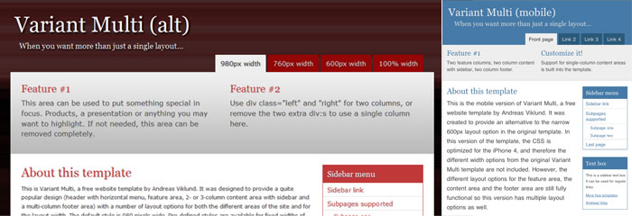

Variant Multi, two alternate versions
The Variant Multi template got very positive feedback, but I got one e-mail about the fact that the narrow 600px layout wasn’t working very well on iOS devices – it appeared very narrow since the Safari Mobile viewport was not adjusted in the HTML. In order to provide a better option, I customized the template and added the viewport meta tag, as well as optimizing font sizes and margins to make it look better on mobile devices while keeping the different content area layout options. For testing I used my iPhone 4 and an iPod Touch (2nd generation).
I have released the customized template as an alternate version called Variant Multi (mobile). You can download it directly here: Variant Multi (mobile). You can also see a live demo of the mobile version to see what it looks like before downloading.
Along with the mobile version, I also created an alternate version with a different colorscheme, background images (very lightweight, 6 kilobytes in total for the three added images) and text shadows. This version is simply called Variant Multi (alt) and it can be downloaded from here: Variant Multi (alt).zip.
This article was written by Andreas Viklund
Web designer, writer and the creative engine behind this website. Author of most of the free website templates, along with some of the WordPress themes.
