
How to create your own header image for Variant Creative
The Variant Creative template is the most downloaded template since its release, and it was also the first template to include a .PSD source file that makes it easier to customize its design. In this post, I will explain how to edit the .PSD and create a new header image for the template.
What you need
- The Variant Creative template (Direct download: variant-creative.zip)
- The file variant-creative-header.psd (included in the template download)
- Software that can open and edit .PSD files (I use Adobe Photoshop CS5, but GIMP and the online Pixlr editor should work just as wel)
- A web browser to view the result
Step 1: Download and open the .PSD file
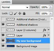
Start with downloading the Variant Creative template if you haven’t done so already and extract the .zip to an own folder. The .PSD file is found in the folder named “PSD”. Open the file in the editor you use. In Adobe Photoshop, you will see something similar to this:
Locate the layer called “Background image”. This layer is the one that will be replaced with a new image.
Step 2: Find, insert and edit the new image for the background layer
Next, find (or create) the image you want to place in the header. It can be a photo, a company logotype or just a plain graphics design image such as a color gradient or an artistic illustration. Insert the new image into the file variant-creative-header.psd to get it into an own layer. Make sure that the new image is placed right above the default background image layer, below the design elements and shadows, like this:
The .PSD is 980 x 220 pixels, so cropping and resizing may be needed. I have chosen to insert a photo of the snowy backyard of my house, and resized and cropped it to make the size fit.
Step 3: Review and save the new image
The .PSD file includes design elements for both the 2- and 3-column layouts, so depending on which layout you want to use you may need to hide the two 3-column layers and display the two 2-column layers. I will keep the 3-column layout, so I will not change the settings for the other layers. Make any adjustments needed to the new background, such as modifying the size and colors or inserting a logo or any other design element you may want to use. Just make sure that anything you add is placed below the column layout and shadow layers.
Once you are satisfied with the result, save/export the result to a new .JPG image and name it front.jpg (to replace the default 3-column image) or front-2columns.jpg (to replace the 2-column version). Put the new .JPG image in the “img” folder of the template. If you want to keep the default background, you should rename it (for example to front-old.jpg) before saving the new image, or it may be overwritten.
Step 4: Check the results in the web browser
When the new front.jpg (or front-2columns.jpg) is in place, open the index.html (or 2-columns.html) from the template folder in your web browser to see the result. This is what it looks like with the image I inserted:
Step 5: Further editing, if wanted…
If you are happy with the result, then the new header is now ready and you can continue with editing the template itself. If you choose a background image with lighter colors, you may need to change the white color of the site title and slogan into something darker, to make sure that it is clearly visible. You can also apply a text-shadow to the CSS for the #header h1 and the #header p to make the text more visible against the background.
These are the lines to edit in variant-creative.css:
#header {background:url(img/front.jpg) no-repeat top left #2a5a7a; color:#fff; height:220px;
margin:0 0 10px; padding:0;}
#header h1 {font-size:3em; font-weight:400; letter-spacing:-2px; margin:0 0 15px 15px;
padding:30px 0 10px; font-family:Georgia,serif; text-align:center;}
#header h1 a,#header h1 a:hover {font-weight:400; padding:0; color:#fff;}
#header p {font-size:1.5em; letter-spacing:-1px; margin:0 0 20px 15px; padding:0 0 0 3px;
font-family:Georgia,serif; text-align:center;}
It may also be a good idea to match the colors of the links to match the main color of the header image. Use the image editor to identify the color you want to use and get its hexadecimal color value. For my example image, I would want to use a darker blue color from the snow, so I use the color picker tool and find the color #37537b. This color can then be inserted as the link color in the variant-creative.css file, or as the accent color for headers or sidebar buttons.
Tried this? Show your results!
If you have used the included .PSD to make a header image of your own, feel free to show me the result and let me know if there is anything I could do to improve the included .PSD. Share your story, either in an e-mail or in a comment to this post.
This article was written by Andreas Viklund
Web designer, writer and the creative engine behind this website. Author of most of the free website templates, along with some of the WordPress themes.


