
Customizing the images in the Variant Note template
The latest free template release, Variant Note, includes three .PSD files (Adobe Photoshop format) that allows the images in the template to be customized in an easy way if you use Adobe Photoshop or any other image editor that supports the .PSD file format. In order to help you get started with the template, I wanted to write a short explanation about the included files and how they are used.
The included files
The three files included with the template are found in the “psd” folder:
- variant-note-background.psd
- variant-note-front.psd
- variant-note-logo.psd
variant-note-background.psd contains the header background, a gray box with a gradient and an outer glow. The box is 1015 pixels wide and centered in the document. It has two layers, where the first is a plain white background layer without any effects. The second is the main layer with the header box, and it has a number of different effects applied to a simple rectangular shape. This box can be replaced with a full-size header image if wanted, but you can also edit each individual effect to give the template a unique look. If you change the body background color in the variant-note.css file, you should make sure to change the color of the background layer in this file as well. Once edited, export the image as a .jpg (.png works as well if you want to use transparency, but the file size will likely be much bigger).

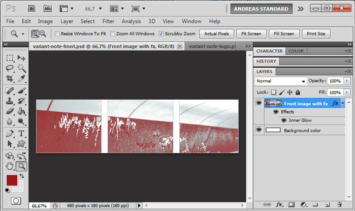
variant-note-front.psd is the sample image in the content of the index.html file. It shows a heavily edited photo of a brick wall in a Stockholm metro station (Hornstull, for those of you who like useless trivia). The photo has been color-matched to the link color of the template, and split into three parts by simply deleting parts of the image. As with the header background, it has a white background color layer and an actual image layer. The image layer has one effect added to it, a one-pixel inner glow that matches the gray lines of the header elements in the template design. If you want to create a similar image but with your own photo, you can use the colors in the image layer and the gradient map feature of Adobe Photoshop to create a similar look. Add the inner glow to your own image layer, and you will get the border to the image.
variant-note-logo.psd is the small box with rounded corners in the header. In the template, it is a .png file with a transparent background. This file works in a similar way as the one used in the Replacing the transparent logo in Basic Landing tutorial, so I recommend that you read that post if you want to make an own logo. This file has two layers, one for the background with the rounded corners and one for the sample logotype shape. Each layer has a set of effects, where the logotype layer has a color overlay that matches the link color (color value #9e1616). As long as the logo image is exported as a .png with transparency, there is no need to adjust any background color. Put your own logotype in a separate layer, use the existing rounded-corner box as a background – and you get a site icon that matches the template design.
A few words about the other design features
Variant Note uses a @font-face kit from Font Squirrel to give the template a more exciting look. To learn more about custom fonts, I recommend this post. There are also some text shadows used. For more reading about text shadows in CSS, see this post.
If you have any questions, comments, requests or ideas about Variant Note, post a comment to this entry. Most new templates generate a number of e-mails with questions, and I would be happy to make an alternate version along with a how-to guide if anyone out there has a good idea for any exciting modification.
This article was written by Andreas Viklund
Web designer, writer and the creative engine behind this website. Author of most of the free website templates, along with some of the WordPress themes.