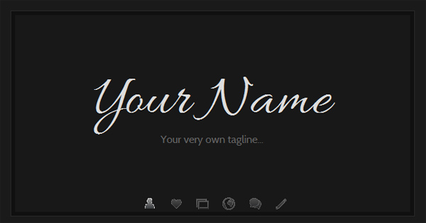

“This is me” template with inverted colorscheme
On request, here is a quick example of how the colors can be changed in the new This is me template. To make the color switch easy to revert, I will do it using a custom class on the body element in the HTML.
Step 1: Add the body class
In index.html, find the <body> tag. In the default template, it is located on line 15. Add a class named “inverted” to the body element, to make it appear like this:
<body class="inverted">
This will allow you to apply styles using CSS that will only be active if the body class is included, which means that you can test different styles without having to edit the default CSS. And by removing the body class, you can easily get the default design back.
Step 2: Add some new CSS styles
Now, with the body class in place, the design will work as it does by default – but you can add new styles that rewrite the default styles if the body class is included as described on step 1. To change a style, first find out what to target. If I want to change the background color and the main text color, this is the line I want to change:
body {background-color:#fafafa;color:#646464;font:12px/16px Cabin, Helvetica, Arial, sans-serif;}
Instead of editing the default style, I’ll scroll down to the bottom of the CSS document and add a new line like this:
body.inverted {background-color:#1a1a1a;color:#e0e0e0;}
Since I do not want to change the font, I will not include it in the new inverted styles. Only the properties that should be changed, needs to be included. The rest will follow the default styles.
Step 3: Continue replacing all styles you want to modify
Repeat step 2 for all the colors that you would want to change. I decided to go with these styles, which you can use by copying the code and pasting it into your stylesheet:
body.inverted {background-color:#1a1a1a;color:#e0e0e0;}
body.inverted #cardstyle {background-color:#101010;border:1px solid #2a2a2a;}
body.inverted #content {background-color:#181818;}
body.inverted h2 {color:#eee;}
body.inverted #start h1 {color:#ddd;text-shadow:0 1px 0 #111;}
body.inverted #bio img {border:3px solid #111;box-shadow:0px 0px 2px #000;}
body.inverted #pics li img {border:3px solid #111;box-shadow:0px 0px 2px #000;}
body.inverted #social li a {color:#ddd;}
body.inverted #social strong {color:#eee;}
body.inverted #address h3 {color:#eee;}
body.inverted #address {border:0;}
body.inverted a {color:#ddd;}
The result is a design that looks like this:

Summary and final words
I have written about body classes before, as a useful tool when modifying website template designs. This is another example of how to use such a class, but as can be seen in the screenshot above, the new background color doesn’t go very well with the menu icons so the colors used in this example may not be optimal for you. If you still want to use a light-on-dark version of the “This is me” template, the next tutorial will come in handy: I’ll explain how to replace the menu icons with new images, so that you will not be limited by the few icons that are included in the template package.
This article was written by Andreas Viklund
Web designer, writer and the creative engine behind this website. Author of most of the free website templates, along with some of the WordPress themes.