

New responsive HTML/CSS template: Leaves
Introducing the Leaves HTML/CSS template, a simple but useful website template made with standards-compliant HTML5 and CSS3 only. It uses two responsive fixed-width grid systems (12 columns), which scale down to a full-width single-column layout on devices with low screen widths. Thanks to the grid systems, there are lots of options in terms of layouts that can be constructed. Check it out, and feel free to post feedback, suggestions and ideas in the comments below.
Leaves HTML/CSS template screenshots
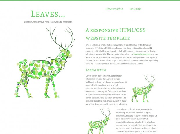
The Leaves CSS template – Full standard layout.
This article was written by Andreas Viklund
Web designer, writer and the creative engine behind this website. Author of most of the free website templates, along with some of the WordPress themes.