New website template: Variant Mini

Post 252 of 262

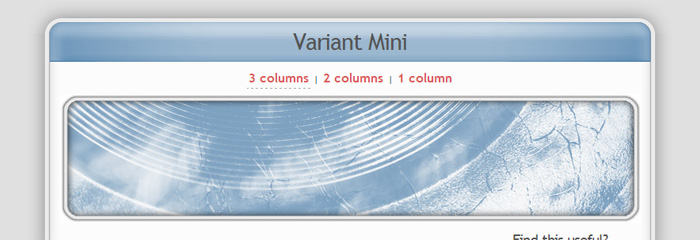
For the launch of the refreshed andreasviklund.com, I am happy to present a new template for you: Variant Mini! It was created as an attempt to combine the concept of including several layout options with using as little CSS as possible, and I am quite satisfied with the result. Three layout options are included in the template package, and despite having the basic HTML tags styled to fit together in the design, only about 30 lines of CSS code is used.

Feel free to experiment with Variant Mini, it should be easy to build upon. I hope that it could also be a good starting point for XHTML/CSS beginners thanks to the simple code structure. If you make any interesting modification or add-on to the template, feel free to share it in the Variant Mini section of the all-new forum!

,

This article was written by Andreas Viklund

Web designer, writer and the creative engine behind this website. Author of most of the free website templates, along with some of the WordPress themes.
9 comments:

PhilwebservicesSeptember 3, 2010 at 03:38Reply

wow. . that template is cool. something that is unusual. Nice one Andreas. Thanks for that design, it adds idea for my design!!

Profiling InstitutNovember 27, 2012 at 09:30Reply

What a great template especially for mobile websites. Thank you for that good stuff! Cheers Jan

DJ MünchenSeptember 15, 2010 at 18:16Reply

Thanks a lot for this cool, new theme! Keep on working…

DJ MünchenMarch 31, 2011 at 15:44Reply

Just great this theme.. maybe I’ll take it for my website http://www.frankie.cc oder http://www.dzinegurus.de
Cheers from munich
DJ frankie

Hochzeit DJ MannheimFebruary 21, 2012 at 20:58Reply

Thank you for this very needful template.

Vincent JimaaAugust 4, 2012 at 21:20Reply

Great Template…
Thank you for posting
Greats

Vince

Christian BleissemOctober 21, 2012 at 23:25Reply

It works, thank you so much for this great Stuff

Akexandra R.December 1, 2012 at 00:49Reply

This is very nice…:-)
Thanks a lot
Alex

MarcelDecember 22, 2013 at 15:46Reply

It looks very nice. I am not sure if it fits to my website: http://www.proakustik-online.de
But i will try to do it :-) Thank you!

Menu