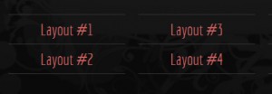

Freestyle template – The navigation menu
 The Freestyle template features a basic navigation menu style that can be used to create both horizontal and vertical navigation menus. I’ve been asked to explain how it works, so here is a quick rundown.
One class: .menu
The navigation menu is basically one or several unsorted lists (the UL element in the HTML) which have been given the class=”menu”, like this:
<ul class="menu">
  <li><a href="index.html">Layout #1</a></li>
  <li><a href="index2.html">Layout #2</a></li>
  <li><a href="index3.html">Layout #3</a></li>
</ul>
The list adjusts to the grid system and multiple navigation menu lists can be used, meaning that you can place more than one navigation menu in the layout. If you want to use a horizontal menu, then place a list with one list item (the LI element) in each list, in a set of columns placed horizontally. If you want to use a vertical menu, place a list with several list items in a single grid column. It is also possible to combine the two forms into a grid menu. Examples of all three forms are included in the template .zip.
Freestyle does not support dropdown or popout multi-level menus by default, but it is one of the things that are considered for the next version of the template. “Current page” is another proposed feature. Is there anything else you would want to see in terms of features for the navigation menu in the next version of the Freestyle template? Post your suggestions and ideas as comment below!
This article was written by Andreas Viklund
Web designer, writer and the creative engine behind this website. Author of most of the free website templates, along with some of the WordPress themes.