
How to use the Freestyle template grid
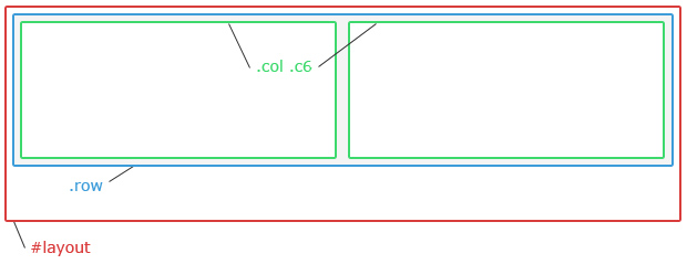
The latest free HTML/CSS template release, Freestyle, is built using a simple dual-grid system that makes it easy to construct any layout needed and wanted. In this post, I will explain how to use the grid. First of all, let’s look at the basic structure of div:s that are used.

#layout – the wrapper
The main layout is placed in a single div with the id=”layout”. It sets the general layout width, by default to 960 pixels. The Freestyle template also includes a body class that changes the width of the ID #layout to 1200 pixels, to allow an optional wider layout. Read more about how body classes in this tutorial. In this post, I will use the default 960px width.
This is the HTML we start with:
<div id="layout">

</div>
.row – the row class
Inside the layout div, there can be any number of rows. Each row is created by a div with class=”row”. The row has the same width as the layout div, by default 960 pixels. In this example, I will use three rows, which gives a HTML structure that looks like this:
<div id="layout">

  <div class="row">
  </div>

  <div class="row">
  </div>

  <div class="row">
  </div>

</div>
.col and .c1 to .c12 – the columns
Inside each row, there is a third level of div:s that split the rows into smaller areas called columns. This is done using class=”col” followed by a second class that defines how wide each column is. Every row should be filled with 12 columns. But this doesn’t mean that the row should contain 12 div:s. Each div can be 1-12 columns wide, and this is controlled by classes called .c1, .c2, c3 – and so on up to .c12. For example, a div with class=”col c2″ takes up two columns in the grid, leaving room for 10 more columns. A second div with class=”col c10″ fills this space, resulting in a simple layout with a narrow left sidebar and a wide content area.
Each row should always contain column div:s that add up to 12. So in this example, where I want a single column header, a 2-column content area and a single-column footer, I would use this code:
<div id="layout">

  <div class="row">
    <div class="col c12">
    (header section)
    </div>
  </div>

  <div class="row">
    <div class="col c3">
    (left sidebar)
    </div>

    <div class="col c6">
    (main content area)
    </div>

    <div class="col c3">
    (right sidebar)
    </div>
  </div>

  <div class="row">
    <div class="col c12">
    (footer section)
    </div>
  </div>

</div>
Additional column div styles
Each column div can be given additional classes, beside .col and .c1-12, to change the way content inside the div is presented. Here is a list of some of the included classes that can be used, and what they do:
.alignleft – Makes the content in the div aligned to the left.
.alignright – Makes the content in the div aligned to the right.
.aligncenter – Makes the content in the div centered. Can be used for centering site title and slogan, or the footer.
.alignjustify – Makes text in the div fill the entire width of the column.
.larger – Makes the font size in the div larger (1.2 em).
.smaller – Makes the font size in the div smaller (0.9em).
There are also a few additional classes used for design touches, such as .separator and .footer. Check the sample layouts included with the Freestyle template to learn how they can be used.
Summary
In short, it is all about keeping track of the div structure and the numbers. Inside the div id=”layout”, you can place any number of divs using the class=”row”. In each row, there is space for 12 grid columns. This can be used for a single div with class=”col c12″, or for multiple div:s as long as the c[number] adds up to 12.
In the next post, I will reconstruct the layout from the first HTML/CSS template I ever created, andreas01, and explain more about how the navigation menu styles work.
This article was written by Andreas Viklund
Web designer, writer and the creative engine behind this website. Author of most of the free website templates, along with some of the WordPress themes.