
How to modify the look of Variant Fashion

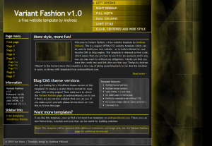
Variant Fashion, default style
The Variant Fashion template is a multi-layout template with several different visual styles, as seen on the screenshots on the template page. All layout options are built into the stylesheet (variant-fashion.css), and it is possible to switch between the different styles by editing only a few lines of the HTML code. When the template was released I promised to write a step-by-step guide on how to use these different layout styles, so here we go…
The starting point
I’m starting off with a fresh copy of the Variant Fashion template (direct download link: variant-fashion.zip), and I want to make the index.html file (which is dark, narrow and left-aligned) look like the clear.html file (which is light, wider and centered). The first thing to do is to look at the HTML code and find the <body> tag. It should be on line #12 if you view the code in a regular code editor.
The body tag does not use any additional attribute, it is written out simply as:
<body>
This will be the first line to edit.
Adding a body class attribute
If you look at the CSS file, you will see that it defines the primary layout in the way I typically do in my templates. Tags, ID:s and classes are defined and sorted into a few different parts of the stylesheet. But further down in the CSS file there are two non-standard sections of CSS code, with a number of lines starting with body.lightstyle and body.clearstyle. These two sections re-define some of the ID:s and classes, and they are triggered by applying a class attribute to the body tag. The first section is the light style that can be seen in light.html. The second is the clear style that I want to use on index.html.
To get index.html to use the clear style CSS, start by adding a class attribute with the value “clearstyle” to the body tag, like this:
<body class="clearstyle">
Then save the file and view it in a web browser. The dark look should now have been replaced with the clear style. The look is dramatically different, but the basic layout is the same except that it is now centered and wider. If you prefer to have the sidebar on the left side, then this is the only change that needs to be done. But clear.html has the sidebar to the right, so one more change is needed.
Moving the sidebar
The sidebar is defined in the HTML code on line #33 of index.html, which looks like this:
<div id="sidebar">
Looking at the CSS file, you can see that there are two style definitions for the sidebar:
#sidebar {background:url(images/leftsidebg.jpg) top right repeat-y;
border-bottom:1px solid #aaa; border-right:1px solid #aaa; clear:both;
float:left; margin:0 0 10px 0; padding:1px 10px 5px; width:120px;}
…and…
#sidebaralt {background:url(images/leftsidebg.jpg) top right repeat-y;
border-bottom:1px solid #aaa; border-left:1px solid #aaa; clear:both;
float:right; margin:0 0 10px 0; padding:1px 10px 5px; width:120px; }
These two look quite similar to eachother, with one significant difference: #sidebar uses float:left while #sidebaralt uses float:right. The float decides the positioning of the sidebar in relation to the main content section.
Further down in the CSS there is a line that modifies both these styles if class=”clearstyle” is added to the body tag in the HTML:
body.clearstyle #sidebar, body.clearstyle #sidebaralt{width:200px; background:none;border:none;}
This modifier makes the sidebar wider (200 pixels instead of 120 pixels) and removes the background image and borders. The body class is already in place, so all that needs to be done is to edit the ID attribute for the div that defines the sidebar in the HTML code, and change div id=”sidebar” into div id=”sidebaralt”, like this:
<div id="sidebaralt">
To make sure that the positioning of the main content area works, a similar change must be made to the div that defines this area. In index.html, this is line #61 and it looks like this:
<div id="content">
Change it into:
<div id="contentalt">
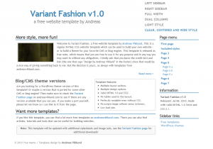
…and the #contentalt style (on lines #52 and #125 in variant-fashion.css) will be used instead of the #content line (on lines #51 and #124). Save the file again and view it in the web browser, and the sidebar should now be to the right. The result:

Variant Fashion using the clear style
Creating your own body classes
By using this kind of modifier through a body class, it is possible to make layout and design modifications while still keeping the default design and layout intact. This can be done on any of the templates, as I will show in a future “how to”-post. It can be really useful if you want the front page of your template-based website to have one layout, while subpages have a slightly different layout. It can also be used to give each page on a website its own accent color – for example by having red links on a page about one topic and blue links on another page about another topic.
The basic rule to keep in mind is that body classes should modify previously defined styles, so if your default link color is set to blue using this kind of CSS:
a {color:blue; font-weight:700;}
…then you can add a body class like this for pages where you want the links to be red:
body.redlinks a {color:red;}
In this example, all links are blue and bold by default. On pages which have <body class=”redlinks”>, links will be red – but the font-weight for the links will remain bold since it is not modified by the body class CSS. The same concept can be used for any changes you want to do, such as aligning images or defining content area widths jus to give a few examples.
I will write more about this and publish more templates that use body classes later this week, so if there is something specific you would want to know – post a comment to this entry and I’ll follow it up in upcoming posts!
This article was written by Andreas Viklund
Web designer, writer and the creative engine behind this website. Author of most of the free website templates, along with some of the WordPress themes.