
“This is me” (dark version) released!
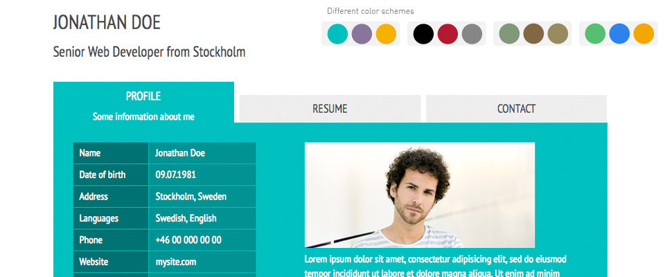
Here it is, the “This is me” template with inverted colors based on the tutorial posted a few days ago. Beside refreshing the colors, I have also refreshed the menu icons to make them fit with the dark background, as well as adding a set of sample photos to give you a better idea of…
“This is me” template with inverted colorscheme
On request, here is a quick example of how the colors can be changed in the new This is me template. To make the color switch easy to revert, I will do it using a custom class on the body element in the HTML. Step 1: Add the body class In index.html, find the <body>…
From template to complete website in 10 minutes
The most popular posts in this blog are the six parts of the Building your first website tutorial. However, going through that tutorial takes some time, and this post is written for those of you who want things to go faster. I am going to explain how you could turn the latest template release, the…
New template: This is me
A few days ago, I uploaded a new template to the site. It is a collaborative project based on the concept of a virtual business card, similar to what I did with the Basic Businesscard template but with all content placed in one single HTML file. Using only 42 lines of CSS code (which includes…
Centered horizontal menus with CSS
I got an e-mail asking how to make a centered horizontal menu, using XHTML and CSS. It may sound easy, but it cause me a lot of headache before I learned how to do it. After trying a lot of “text-align:center” and “margin: 0 auto;” approaches that didn’t work as I wanted, I realized that…

