
New template: The Grid
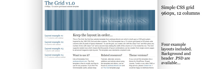
A new template has been added to the website template page: The Grid. It is the first template I release which is using a grid layout system, and it provides a lot of freedom for template users to create advanced multi-column layouts. As always, I have kept the code as short and simple as possible to make it easy to work with. Four layout examples have been included to give you an idea about the flexibility of using a grid system. More layout examples and a tutorial about how the grid system works (and how you create the layout you want) will be published next week.
This is what The Grid template looks like. To download the template, click the screenshot below. To read more, see a live demo or screenshots of the different layout examples, go to the The Grid template page
.PSD source files
In case anyone would want to modify the background or the sample header image that is included, here is a .zip containing the .PSD source files for both the header and the background images: the-grid-psd.zip (242 KB)
This article was written by Andreas Viklund
Web designer, writer and the creative engine behind this website. Author of most of the free website templates, along with some of the WordPress themes.
